Surface and Perfection

I love the suggestion of surface on two-dimensional art; I love to see marks in drawings, I love visual and physical texture in painting, I love to see evidence of the movement of the artist’s hand across a work of art.  The first time I saw a Leonardo da Vinci drawing in person was at Windsor Castle in 1988: I marveled at his mark-making - layers and layers of lines that were the direct result of the movement of his hands. This drawing was from one of the sketchbooks, consisting of hatched lines exquisitely delineated because they were executed with pen and ink - the crisp brown ink lines slightly rising from the yellowed surface of the paper.  It is peculiar that I don't quite remember what the drawing was of (it was definitely a figure), but the lines are so vivid in my mind.  Those lines were more edifying than the demonstrations from my freshman drawing classes: until that point I had only seen his work in art history texts where his sketches were reproduced as color plates (printed via offset-lithography with all those little half-tone dots that are not too unlike a jpeg as far as clarity).  Seeing the actual marks made by his hand was so illuminating because they were not softened and simplified into a perfect and pristine surface with the gloss of the textbook paper refining the image, rather they were the tangible and textured evidence of his movement and, more importantly, the evidence of his process of synthesizing and thinking about what he was seeing. It is not that I mind a perfectly smooth or polished surface in a drawing or painting (so very lovely and seductive indeed) but as far as seeing how the artist thinks and moves, those marks made by brushes, pens and pencils are very telling; honest and revealing, a glimpse into the mind of the artist at the time of creation, not to mention a physical document of the artist’s movement.  There is energy captured in a mark, sometimes there is even struggle and hesitation. I have realized that this is probably why I am so fond of certain abstract expressionists, such as the late work of Kandinsky and both de Koonings (Elaine and Willem).  And, likewise why I am so fond of Andrew Wyeth – although on the other side of the style spectrum, he is another artist whose paintings when seen in person are so much more captivating than the image that is reproduced in books or texts: you can really study the linear movements on his surface – the pure energy and economy and skill of control that is contained within a hyper-realistic accuracy. 

Twenty years ago, I was striving for perfection on a surface – no flaws – even and pristine layers of smooth graphite.  At some point in the past 10 years, I found myself interacting with pencil and paper in a more instinctive way, and this transformation is not because I am working faster: quite the contrary, I have somehow slowed down, as it takes much longer to complete a drawing than it used to take.  But now that I do not concentrate on surface perfection, there are flaws on the surface, dents and impressions on the paper: some of these imperfections I can smooth out upon completion with a light coat of matte medium, but others are there for good.  This imperfection is not the same as craftsmanship, which is something that I have always been compelled to strive for – messiness distracts from the work itself, so presentation remains paramount with clean edges and the white of the paper neat.  Rather, this imperfection is the true physical impression that remains on the surface of an actively worked drawing.

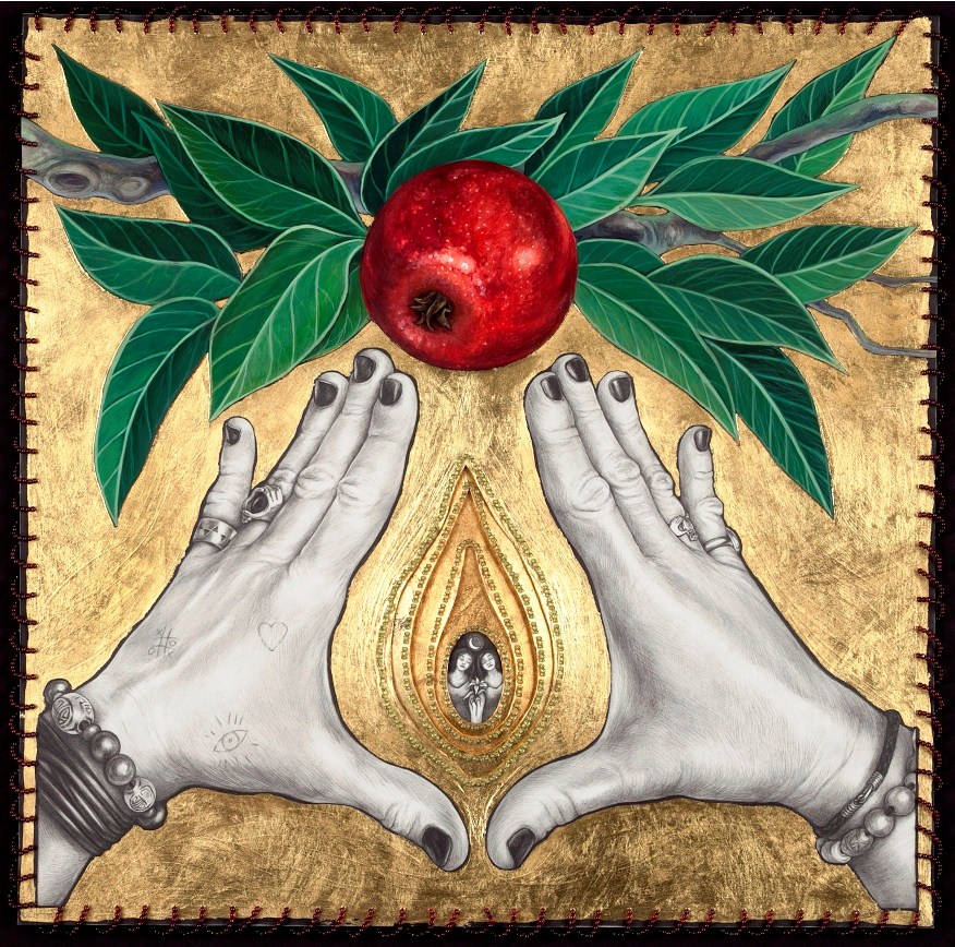
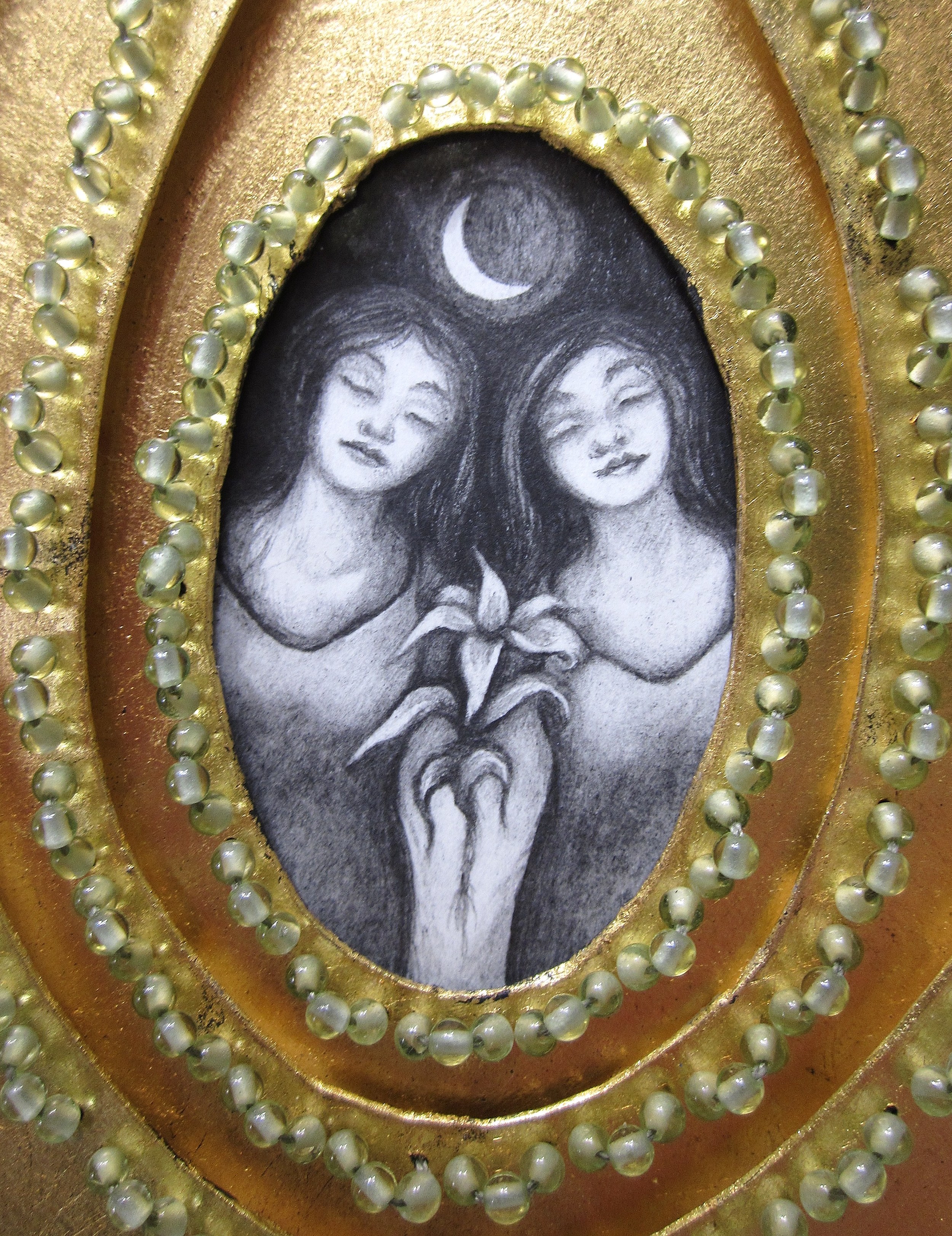
I have found that it is liberating to approach the creation of art not as means to get to a final product, but rather to consider art a product resulting from the compulsion to make.  So, when I am drawing in the studio, I am not consciously aware of how the surface will appear.  The process of drawing is about the sensory contact of pencil on paper, and realizing that paper (as much as canvas or a sculptural medium) is a physical thing that can be torn, bent, cut, held, damaged, transformed and reassembled. More often than not, I am finding that I simply get lost in the back and forth action of drawing, erasing, drawing, erasing and gradually building up value. Now I am starting to have the desire to push the physical properties of the medium, too, such that more and more in my own drawings I want to do stitching, sewing, beading, and manipulation of the paper.

the planning ahead part: testing different beads, pencils, and acrylic mediums on black Stonehenge paper in preparation for the current large-scale drawing

This does not negate planning or consideration about what I am about to draw before I actually start working on a large sheet of paper; I am working in realism, so the structure of my drawings is planned and sketched ahead of time or during or after in some separate part of my brain, allowing the actual process of making to become looser, occasionally meticulous, yet not precious.

Maybe this instinctive letting go of surface perfection is my way of bucking what I fear is a trend towards visual homogenization: seeing so much digitally reproduced artwork on a flat screen monitor.  Maybe it is that smooth suggests to me Plexiglas and enamel and other surfaces of mass production.  I want earthy and tangible, I want a touchable, physical surface and the feel of the artist’s hand.

On that last thought of earthy and tangible, here is a link to the too-good-not-to-share posthumous video commentary of Lucian Freud’s painting ‘Standing by the Rags’ from the Guardian’s art critic Adrian Searle: “Freud didn’t so much have a career as a life”.  

In the next week or two: Thomas Kinkade, Goya, and detail photos of the drawing in progress.

jpegs

The web mistress (as she calls herself) who is otherwise known as Jo Bradney, fellow artist and the lady responsible for the way this website appears, has created a webpage for my site that will allow for zooming into the detail on my drawings.  I am immensely pleased that this is going to be up and running soon; I have a serious - and I mean serious - dislike of the clarity of these little jpegs online. Overall, I am rather ambivalent about jpegs: they are unquestionably easier than slides – easier to arrange, edit, label, and store, not to mention the fact that digital is so much cheaper (it once cost a small fortune to make duplicate copies of slides).  I truly have no desire to go back to slides.  But, I am vexed by having to depend on jpegs for entering shows or to go along with proposals for exhibitions – they just don’t look quite right nor do they accurately reflect my artwork. Unlike slides, which, under normal viewing, were projected in their fully detailed glory onto a screen, digital images are confined to itty bitty little monitors, making my drawings appear as little book illustrations rather than the large-scale objects that they are.  Or, much worse, jpegs are displayed via LCD projectors onto screens so there is this overall pixelated quality to the image. I suppose that at the very least I should be happy enough that I am not trying to reproduce the depth and light of encaustic or the texture of impasto paintings digitally.

I am reminded of an interview I once heard with Neil Young around 20 years ago: he was complaining about the tinny sound of CDs as a result of the way the music is stored in a digital recording. Essentially, the pure sound of the musical information is simplified and broken down into digital bits, 0s and 1s. He compared it to an analog photograph versus a digital photograph – an analog photograph has all of the pure subtle transitions of light and value whereas the digital photograph abridges visual information into small squares of data.  The sound is on digital is not pure (and, if you have ever listened to an analog recording on a high quality vinyl record, played via a good pair of speakers, off a good turntable through a good amp, then you know what I mean – it makes an mp3 recording of music seem like you are listening through a tin can).

Which brings me to my true vexation with jpegs: since the level of resolution used for most applications or shows is so low, the information does not accurately portray the artwork, almost regardless of media, whether realist, abstract, or three-dimensional (although I suspect that jpegs might be fine for photographers or those working with digital media).  The concept is often clearly translated through a jpeg (the image is the image) and the values and colors may be correct, but the magic that is a true work of art is not reflected: the details, the marks, the movement, the surface, the scale, the light, and that enchanting thing that is transmitted from a work of art that has been touched by the artist.  A good slide, which normally had to be projected onto a screen (not on a little monitor), often came a whole lot closer to representing the essence of the artwork. 

It is interesting that for such a progressively more visual culture we are getting less and less of the intangible and magical power from the presence of an actual work of art, and more of a cursory impression of the idea and concept behind the artwork.  [Sigh] and then again, there is the not-to-be-ignored, fantastic ease of getting your work out there on the internet in this world of digital imagery at your fingertips.

So, can you guess what I will be doing over the next few weeks? Organizing my jpegs for applications that I am sending off in the mail. It does not escape me that nearly every show I have had was as a result of word-of-mouth or a curator seeing my work in person – rarely off these little reproductions.  But alas, there are some things I want to apply for that are only taking jpegs, so it is time to suck it up and send these jpegs off, because this is how things are done these days. 


August odds and ends

First on the list of odds and ends for August: I now have a twitter account and I just set up a public Facebook page for my artwork. Yes, I set these up just in time for everyone to switch to Google+. Seriously, I wanted to be able to tweet my blog posts and coordinate that with Facebook. Plus, since I have been reading my husband’s twitter feed to skim over the news article links, he suggested that I could get my own account.

Twitter is here: sarahpetruz

And, you can be a fan of my artwork on my new Facebook page (come on, be a fan!!!)

Of course, the rss feed is still over there on the right. That works, too.

Next up on odds and ends: my friend, fellow artist, and mentor Barbara Minch has started a blog on creativity - the artist’s idea factory - and you can now see her artwork on her new website.

And, to close out the list of odds and ends: several months ago I gave permission for one of my drawings to be used on the cover of the Turkish edition of Michael Pollan’s The Botany of Desire. The publisher did a wonderful job with the design (click here to see) - and beautifully integrated the image with the text (and the image works so well with the concept of the book itself). For those of you who knew about this from the beginning, I am happy to report that they did pay for the use of the image (I have not received a copy of the book, although they forwarded a high res pdf of the front and back cover). I know that a lot of artists get cheated by not getting compensation for their work when it is used outside of the US; sending digital files, only to discover that there is no reasonable legal recourse when payment is not made is a frustrating and belittling experience. In my case, I trusted they would pay, and fortunately they did. But, if anyone wants to start up an international visual art image broker available for all artists (in the style of Getty or Corbis, but with the unrestricted accessibility of an eBay, that would function in a PayPal manner - payment made by the client first, and then distributed to the artist when the files are uploaded) take my suggestion and please do. And, let me know when you get that started up – or, if one already exists, someone please let me know, because it is rather shady and unsure out there in copyright/compensation land for the individual artist.

I might actually end up in the black this year with art sales and such …not so bad after 17 years in the studio.  Next week's blog...jpegs and my sanity.